 "area man" (hurrburgring)
10/26/2016 at 10:14 • Filed to: fonts
 0
0
 3
3
 "area man" (hurrburgring)
10/26/2016 at 10:14 • Filed to: fonts |  0 0
|  3 3 |

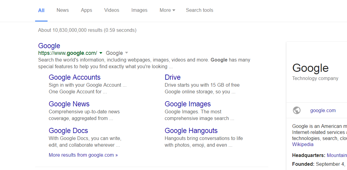
For all you typography nerds out there - yesterday I came home from work and booted up my laptop, only to find the default display fonts looking a little... different. It’s subtle, but if you do any kind of visual work you can see it’s off. It’s also slightly bigger, which pushes more of any web page off the screen:

That is all I see when I open Oppo, even less on any GMG sites because of the top stories bar. It’s happening with both serif and sans serif fonts. The headline below looks normal, because it’s set by nytimes.com, but the character width and kerning on the non-headline text look different too:

Everything in my settings is still set to default with no zoom, and I haven’t fucked around with installing any pirated fonts for Photoshop or anything. Anyone ever encounter this, or know what I should do? Most threads I see on forums are about the fonts going totally haywire, not this slight shift.
 Jcarr
> area man
10/26/2016 at 10:21 |
|
I noticed as well. I found this and it seems to work for the time being.
 area man
> Jcarr
10/26/2016 at 10:34 |
|
Amazing, that worked perfectly. Thanks!
 MM54
> Jcarr
10/26/2016 at 19:52 |
|
Had the same issue on my work computer starting yesterday, fixed it earlier today with the same fix you linked to.